
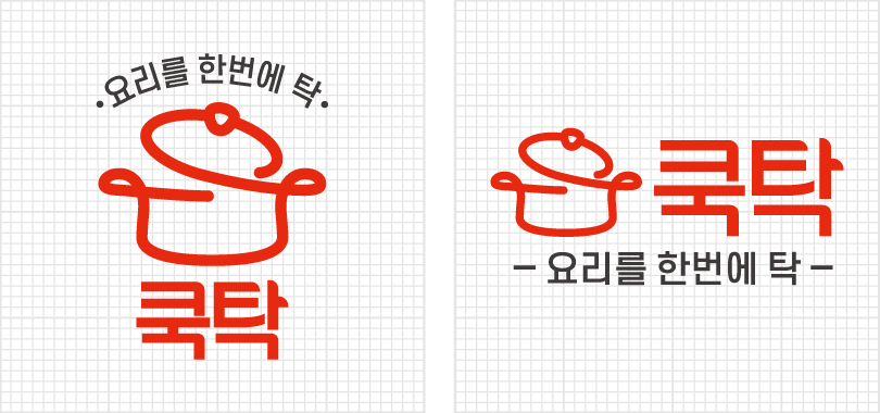
COOKTAK is Dongsung Foods' distribution brand, embodying the idea of "finishing a dish in one go." It represents our passion for revolutionizing food distribution.
Our Brand Identity (BI) is built on food safety and empathy with evolving generations. Leveraging 30 years of B2B expertise in quality and trust, COOKTAK aspires to be a leading brand that grows with each new generation.
The symbol mark—a cooking pot drawn in one continuous line—represents a seamless cooking process. The broken ends of the logotype symbolize eliminating unnecessary distribution steps.
The logotype is a core visual element that, together with the symbol mark, defines the COOKTAK identity.
It must always be used in its original proportions, scaled only uniformly, and never altered, distorted, or modified.
The broken endings of the Korean logotype symbolize streamlined distribution. Designed for harmony with the symbol mark, it is a key element in communicating the COOKTAK brand.
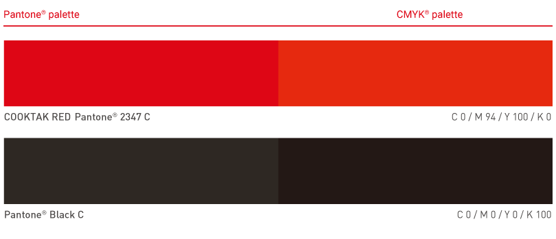
COOKTAK uses COOKTAK RED as its primary brand color, symbolizing appetite, energy, and speed.
COOKTAK RED visually represents speed, efficiency, and premium quality.
 COOKTAK STORE